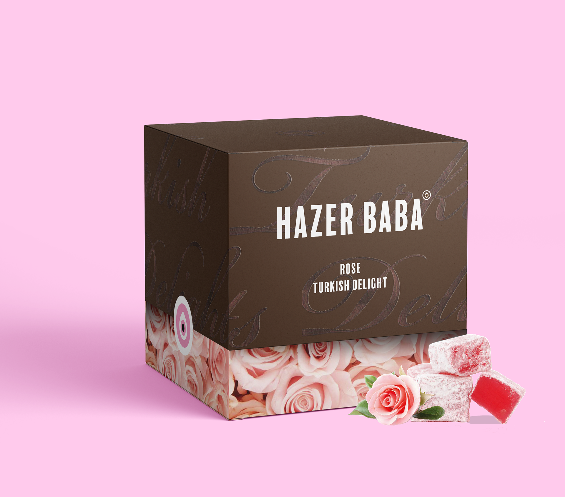
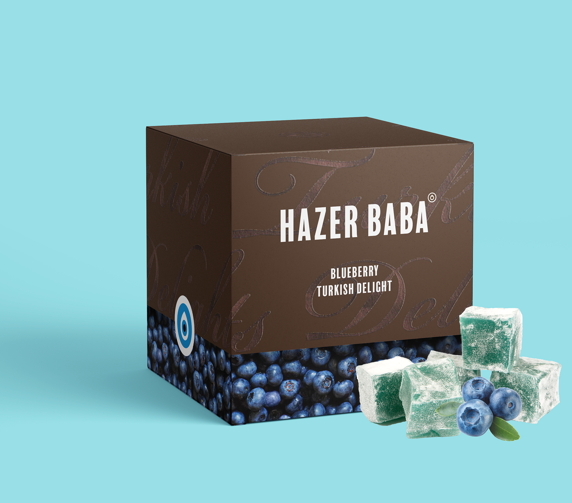
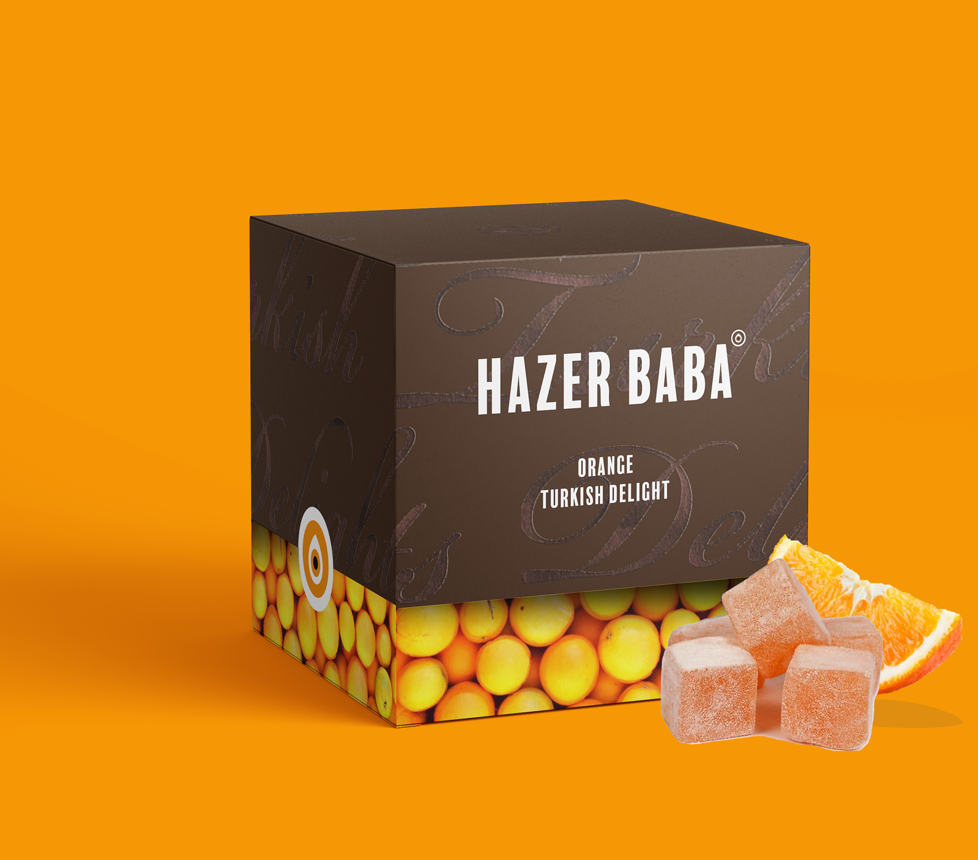
Packaging design
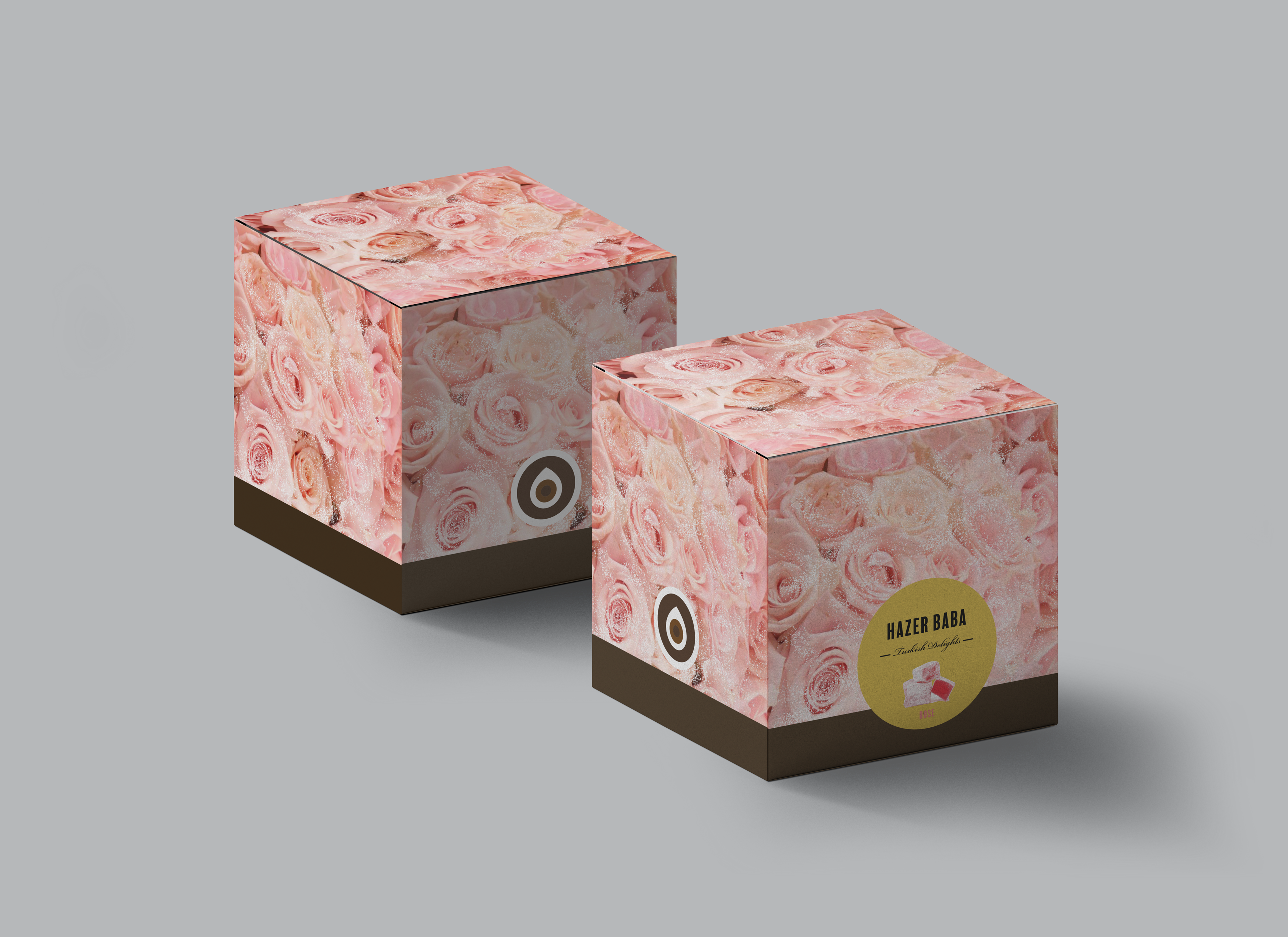
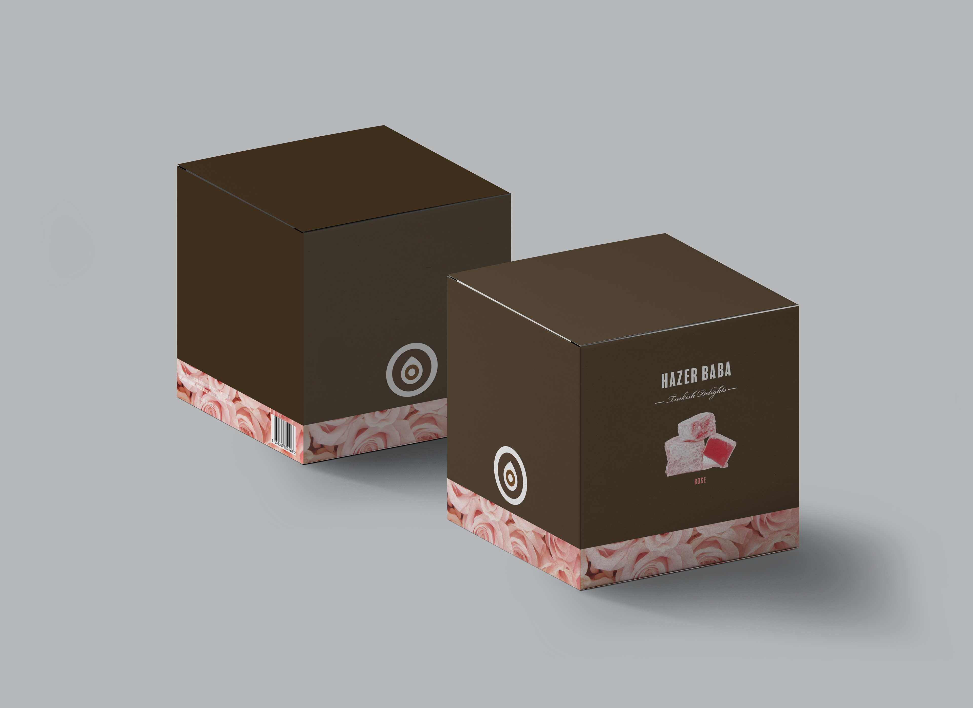
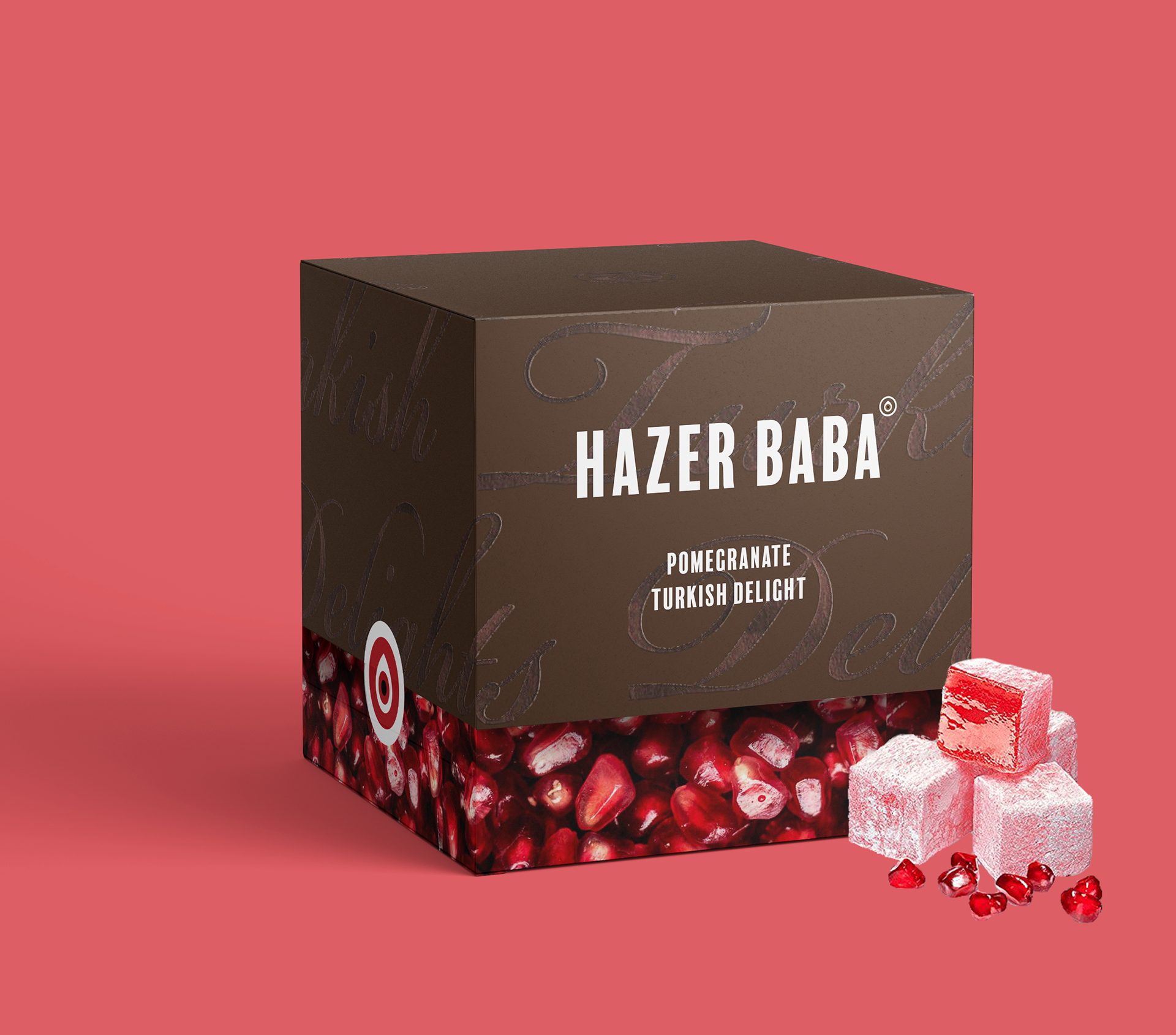
My aim was to create a dramatic and exaggerated version of the flavour because with Turkish Delight people are usually quite particular on what flavours they prefer, so it's good to notice this aspect first. It's a fun customer experience to lift the lid off and have the effect that the flavour oozes out. However, the element of luxury is still included by the use of the rich chocolate-brown colour that feels less harsh and has connotations to strong espresso coffee, which Turkey is well-known for doing well. The minimal design on the lid strips back the noise and the hot foil thermography effect allows for a strong luxurious identity. The meaning behind the eye symbol for the stickers on the side is protection from the ‘evil eye’ and to bring luck. Many Turkish or Arab cultures can recognise this symbol, due to be very apparent in their countries, which makes them feel more trustworthy towards the company.
Front design with lid.
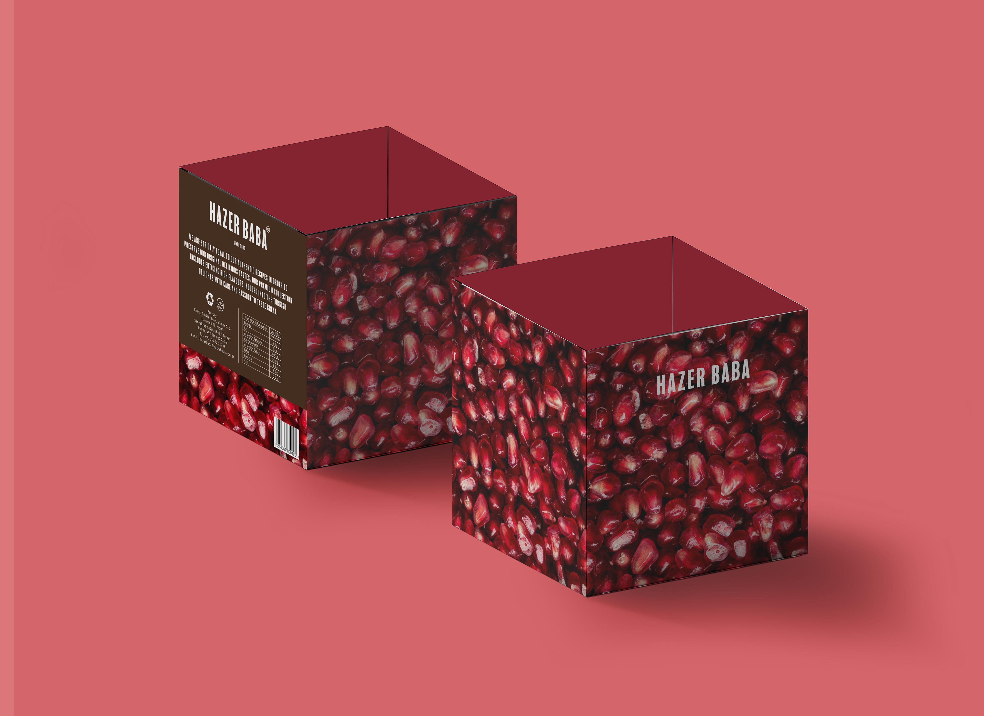
Front and back design of the box underneath the lid.

Revealing the hot foil thermography texture on the lid. It's a decorative aspect but also makes it evident what the product is.


Point of Sale display
This was to help assist the promotion of the new luxury range. The aim was to be placed in high-end supermarkets or shops, such as Waitrose or Selfridges, to showcase all the main flavours in the range. It reveals the packaging so that the customer knows what to look for and the actual Turkish delight so that they know what they're buying.
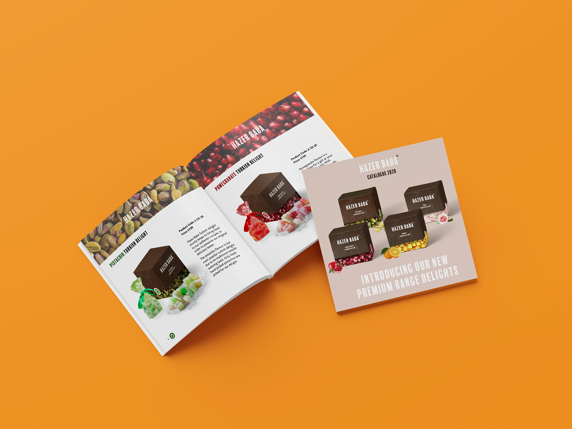
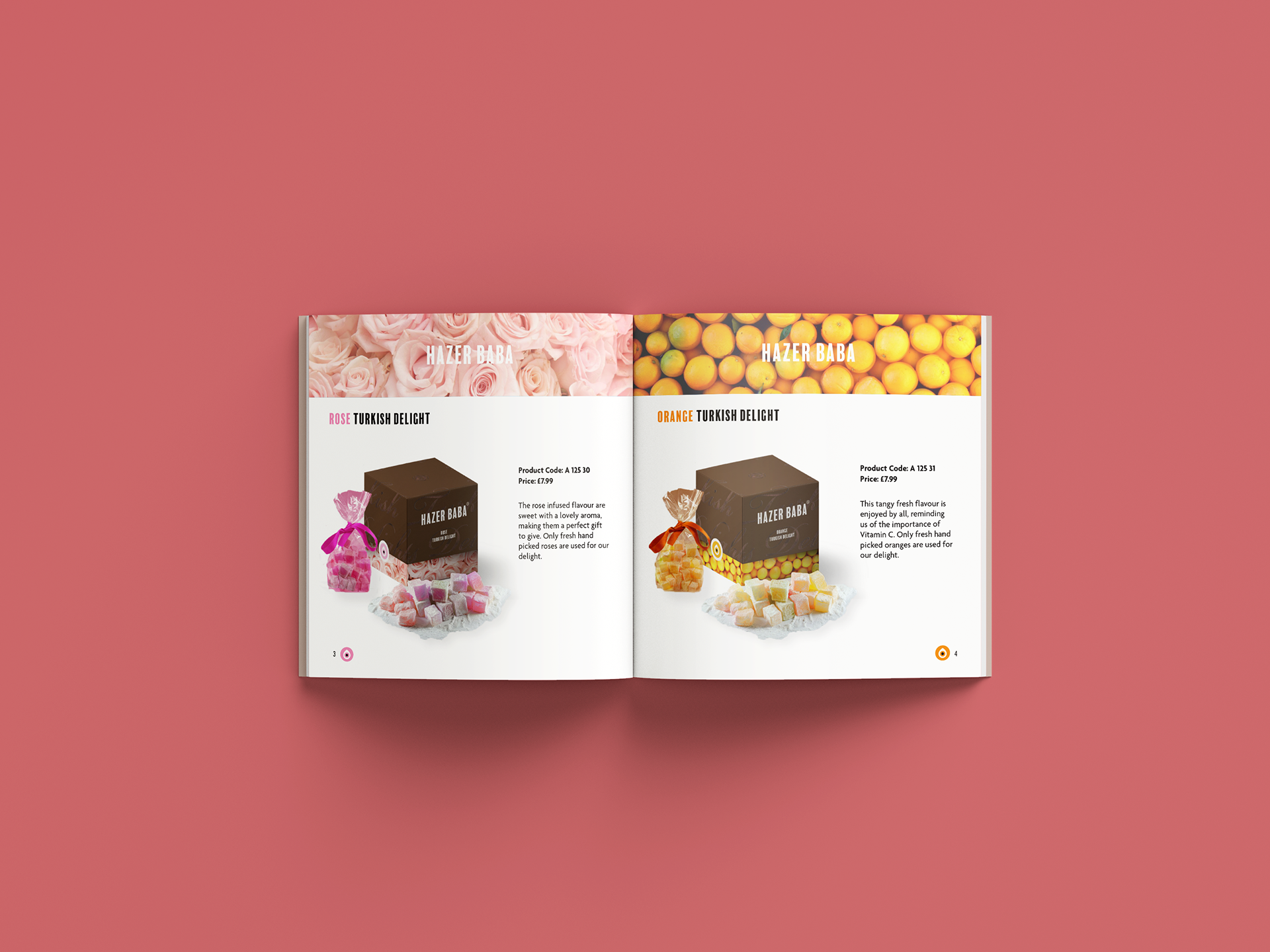
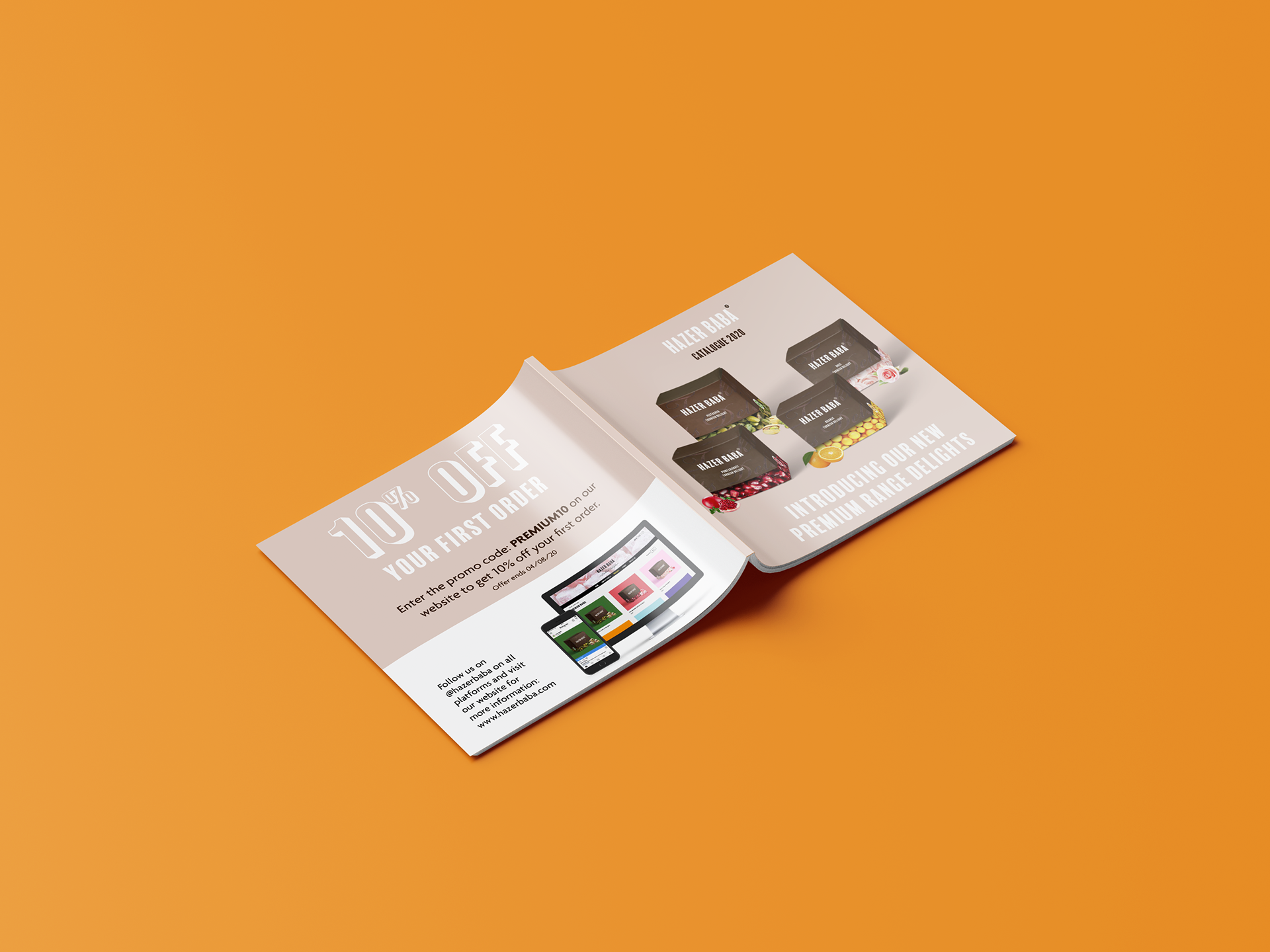
Catalogue introducing the new premium range
The product catalogue was designed for extra promotion of the products, that the customer would find inside of the packaging, alongside the Turkish delight. It showcases the other flavours in the range to tempt customers to buy more, either for themselves to try or as gifts. This is also emphasised further with the voucher on the back of the catalogue, as it aims to help persuade the customer even more with a discount code.
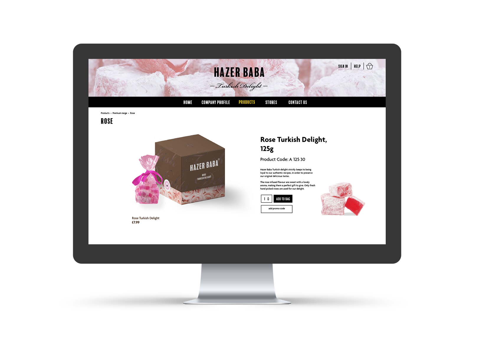
Website

Instagram promotion video
Logo rebrand development
Balboa Plus was the primary logo typeface chosen due to its strong presence and being bold and tall, however it has subtle elements to it, which reflects a modern Mediterranean feel. The sans serif contrasts well with the script typeface that says ‘Turkish Delight’ and adds character; by resembling the rich history that Turkish delight have been around for.
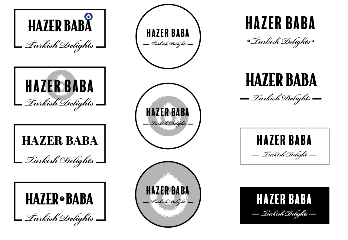
Bottom right was the final outcome.
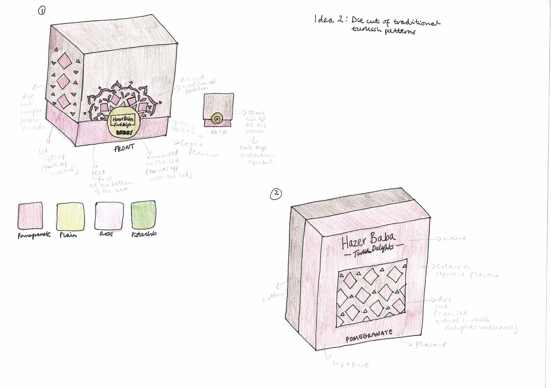
Initial design sketches
My approach was to think of three main concepts and within these designed multiple ideas for each, they were: photographic flavour as the main pattern, die cut of traditional Turkish patterns and the ‘evil eye’ protection symbol. All of these designs had a common factor of being boxes, due to the product itself, as Turkish delights usually are sold in boxes to keep them secure and fresh but also is more economical to do so.
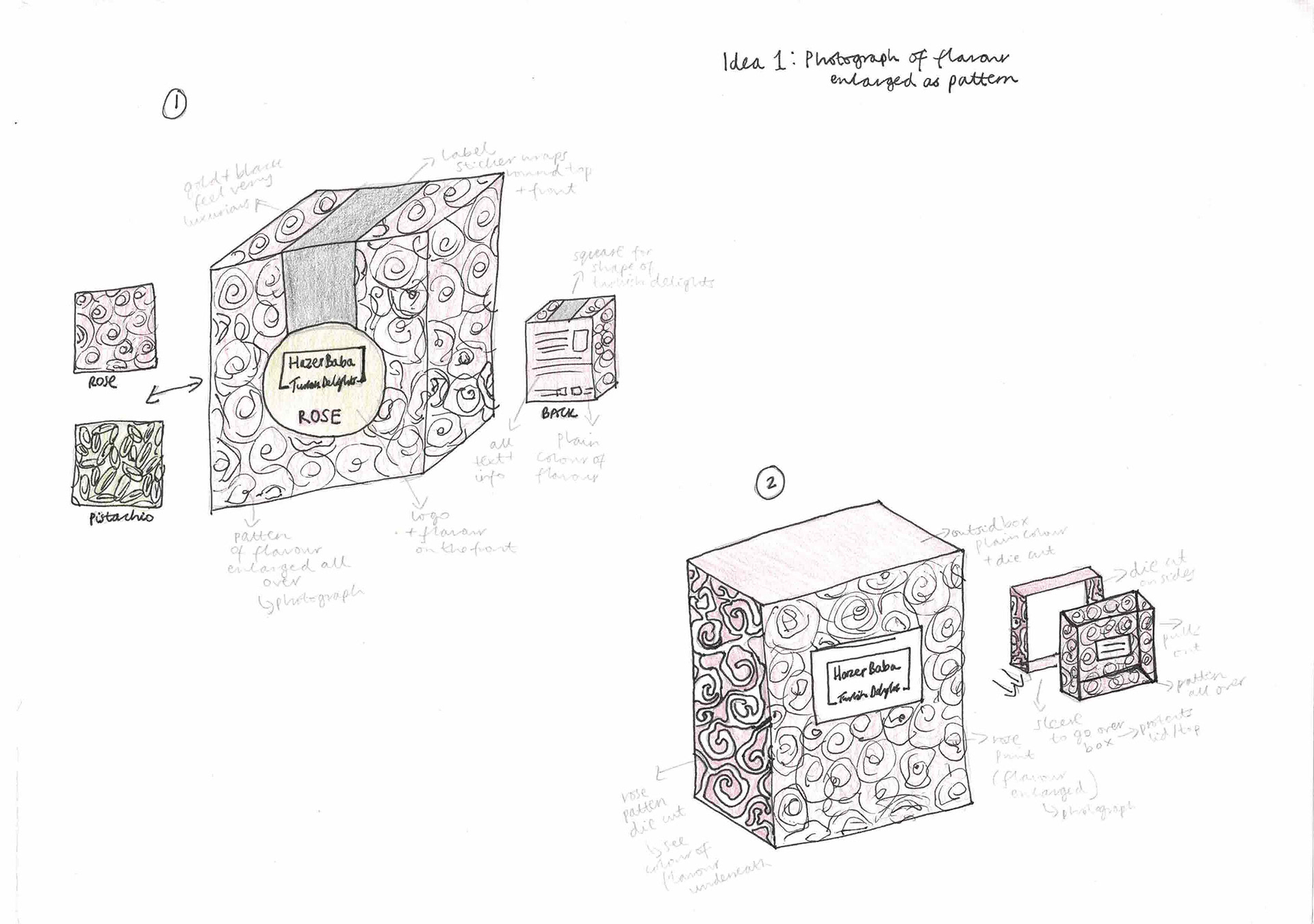

Initial design development ideas
Initial designs included having the flavour pattern on the outside and a more minimalistic lid, however through several explorations I decided to incorporate more elements into the design. The flavour worked best underneath as it added an exciting surprise element to the user experience. I also removed the picture of the delights from the front lid as this was too obvious, and instead replaced it with hot foil thermography stating it in written form.