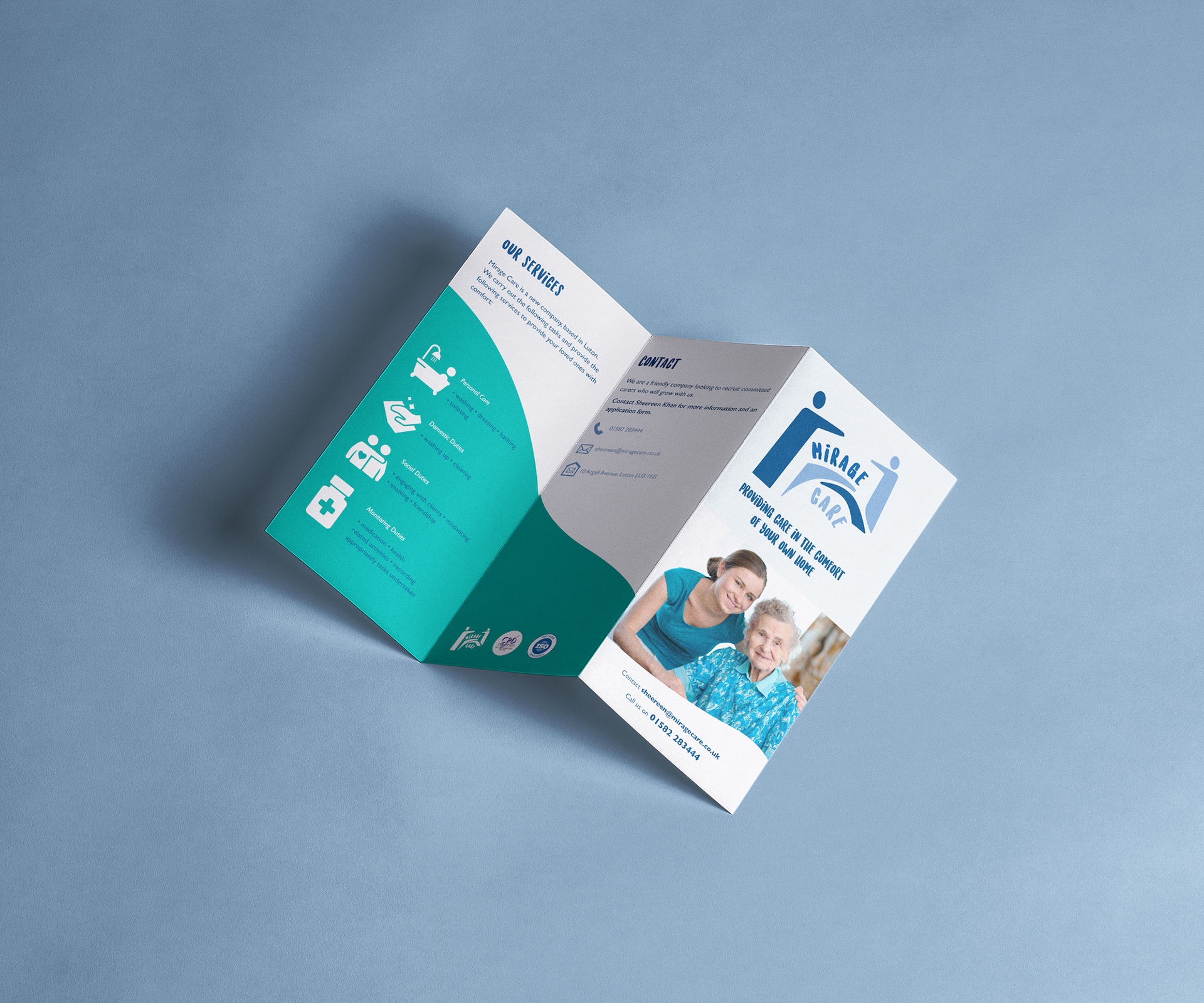
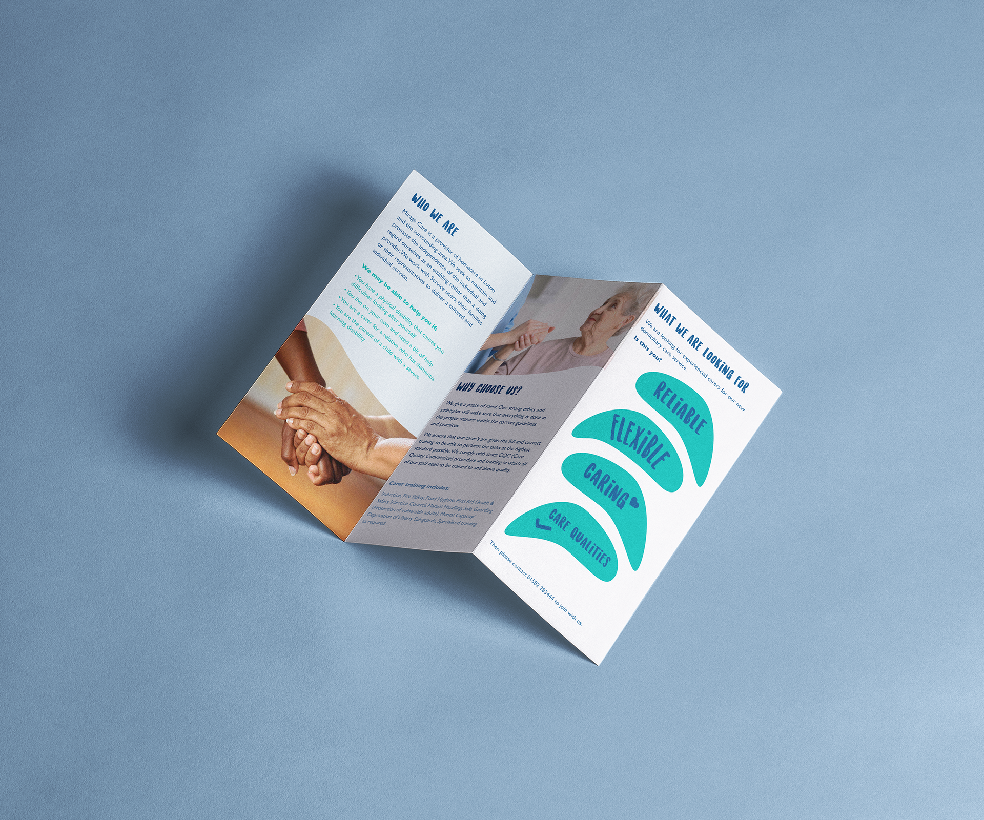
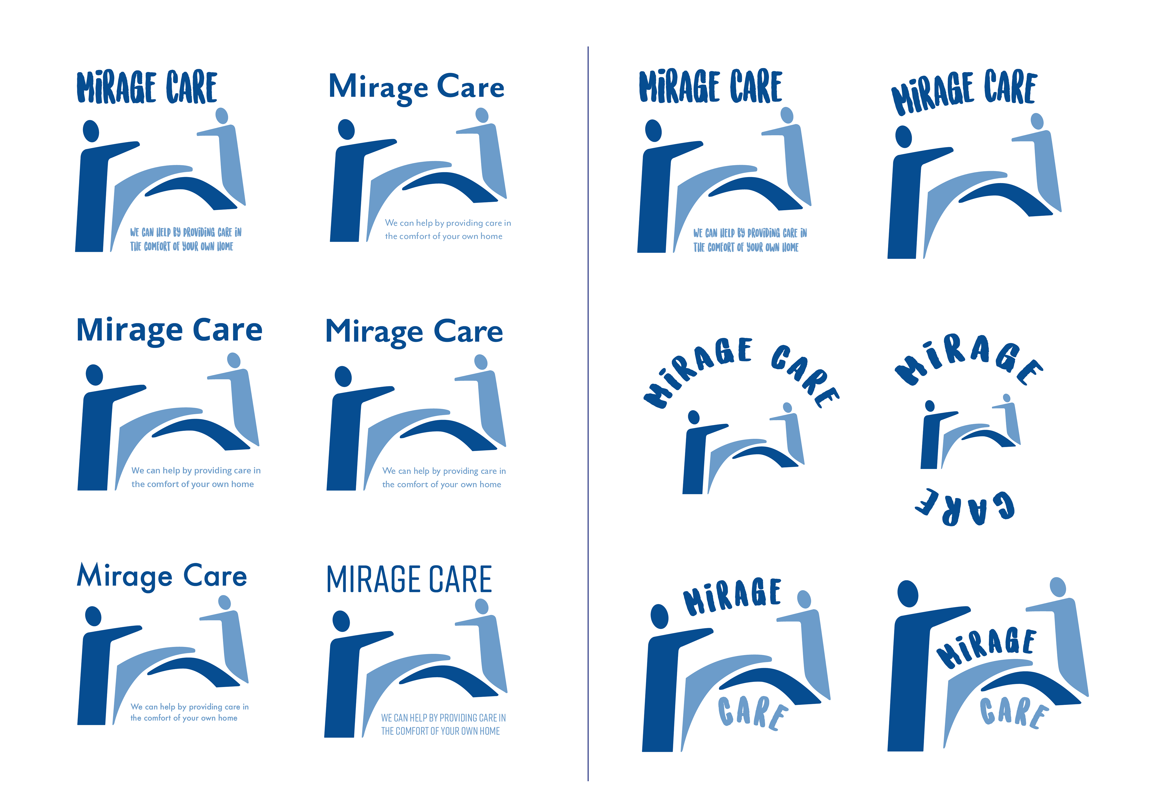
The clients brief was to create an accessible leaflet for their healthcare services company called Mirage Care. The client presented to me an existing logo, however with their approval I updated it to make it more contemporary. The client gave brief points of what they wanted, such as including all key information, having folds and a preference for blue tones.
The design therefore respects the clients wishes by having a blue toned colour scheme and being a try-fold leaflet which is easy to takeaway. Icons were incorporated to bring the design to life and to make it more playful. The typeface was introduced to match this style and to feel more welcoming, due to the nature of the cause.
Logo variations
Left: Typeface choices. Right: Text and icon layout options.

Original and final logo.