'Making a difference in Palestine and Israel' EAPPI booklet foldout
Ecumenical Accompaniment Programme in Palestine and Israel (EAPPI) is an international programme offering protection and to mitigate friction between Palestine and Israel. My colleague on this job and I aimed to create an effective visual impact to ultimately spread awareness and elicit engagement with the audience. The purpose of the foldout was to inform the public the work that EAPPI do and how they can get involved.

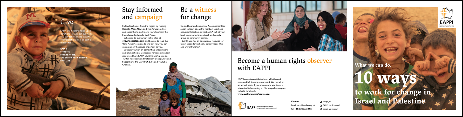
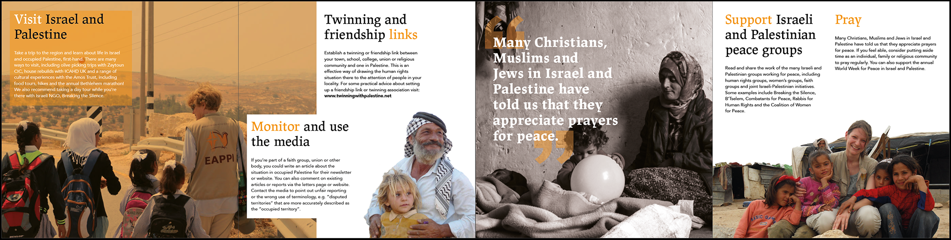
Both sides of the foldout.
Image exploration
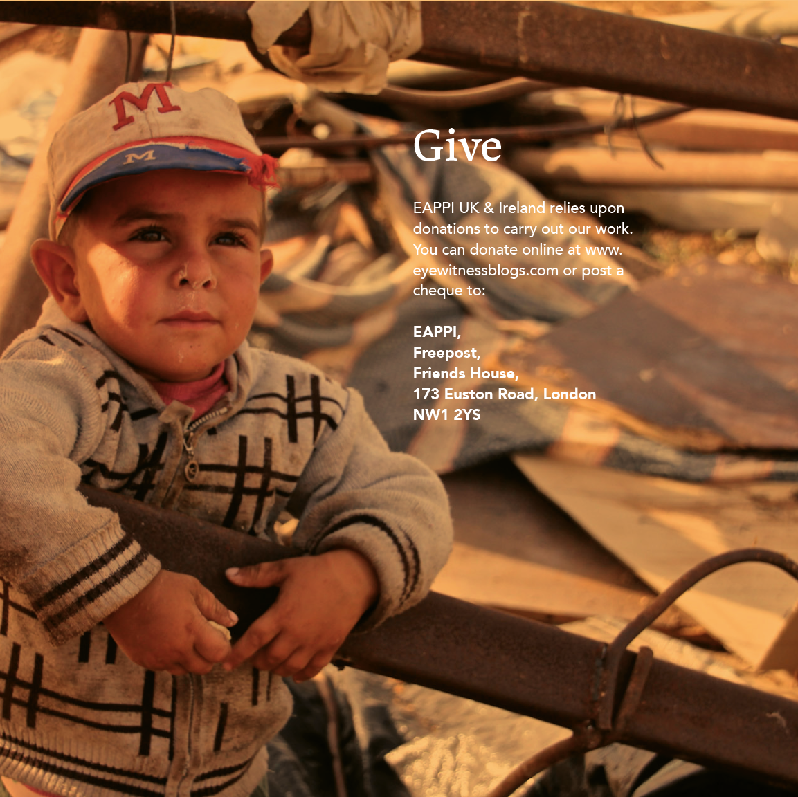
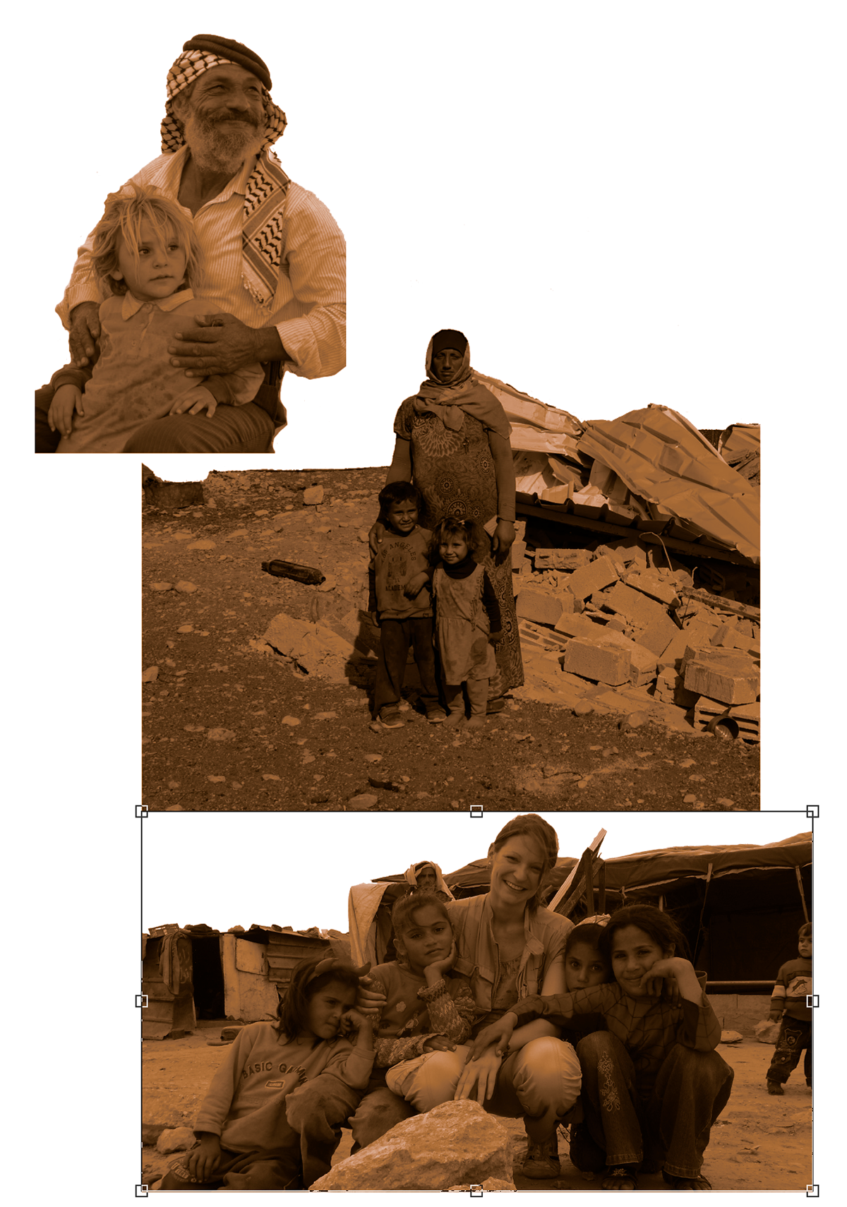
Due to all deliverables being printed with the purpose of giving hope and inspiring others to join, the tone of the imagery and design needed to be uplifting. Therefore, we chose to use images of the serene scenery, the locals smiling and the EAPPI workers helping/teaching. We experimented with using orange filters and duo-tones over the images to connect this to the overall colour scheme. However, we felt that this over powered the design and most images worked best in their true colours, therefore we used the filters very sparingly.
Exploration of using duo-tones and filters.
Updating the logo
Unexpectedly, our team also resulted in rendering and updating the EAPPI logo. We found a problem with their existing logo as it only came in black and had a white background. Therefore, we took this upon ourselves to edit the logos to add a white version and their brand’s orange version to their assets. The client was overjoyed with this and requested them all for future use.

Old EAPPI logo that only came in black.
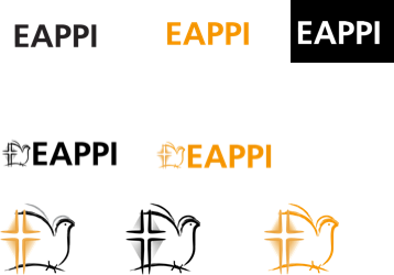
Updated logos to have white and their brand's orange options.
Layout developments
The format for the foldout is a 150mmx150mm roll fold document consisting of eight panels in total. This format is quite small, which is appropriate for keeping a low budget and allowing audiences to carry them in their bags easily after a talk, whilst still containing all the relevant information needed.
Final outcome

Small square format to be easily carried around or taken away at EAPPI talks.

We emphasised important pieces of text in a bolder weight to help the user easily retain the information.

Showing the use of EAPPI's brand identity of the Lapture typeface and orange Hex colour #Ed8000.
For more in-depth information on our process and outcomes of this job please read our blog post on the Typography Network.